Onboarding Home
Making genetic test ordering easier for providers

#1 reason for churn
Productboard is too complex for our needs.
Problem 1
The current onboarding home experience is closely tied to pricing & packaging, requiring users to choose a plan first.
Problem 2
Having too much flexibility is confusing users about the best way to start with the product.
Problem 3
Hard to understand the interconnectivity between different boards and workflows.
“It took me 17 clicks to get the right tests and add-on combination for my patients.”
— Gregory, Oncologist
Solution Discovery
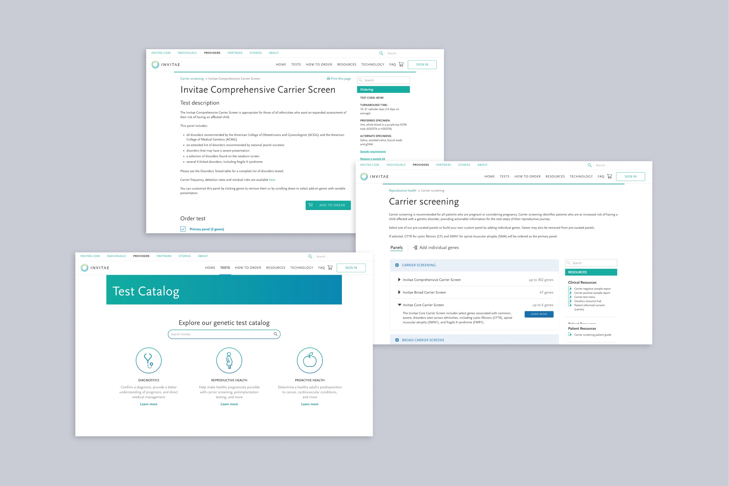
Re-organize test offerings
First, we needed to restructure test categories that work for broad user types. We brainstormed on how best to group test categories and come up with new category names.
We grouped the test categories into how they are in our system today then translated these grouping names into straightforward language. We wanted to stay away from medical terminologies and use plain language.

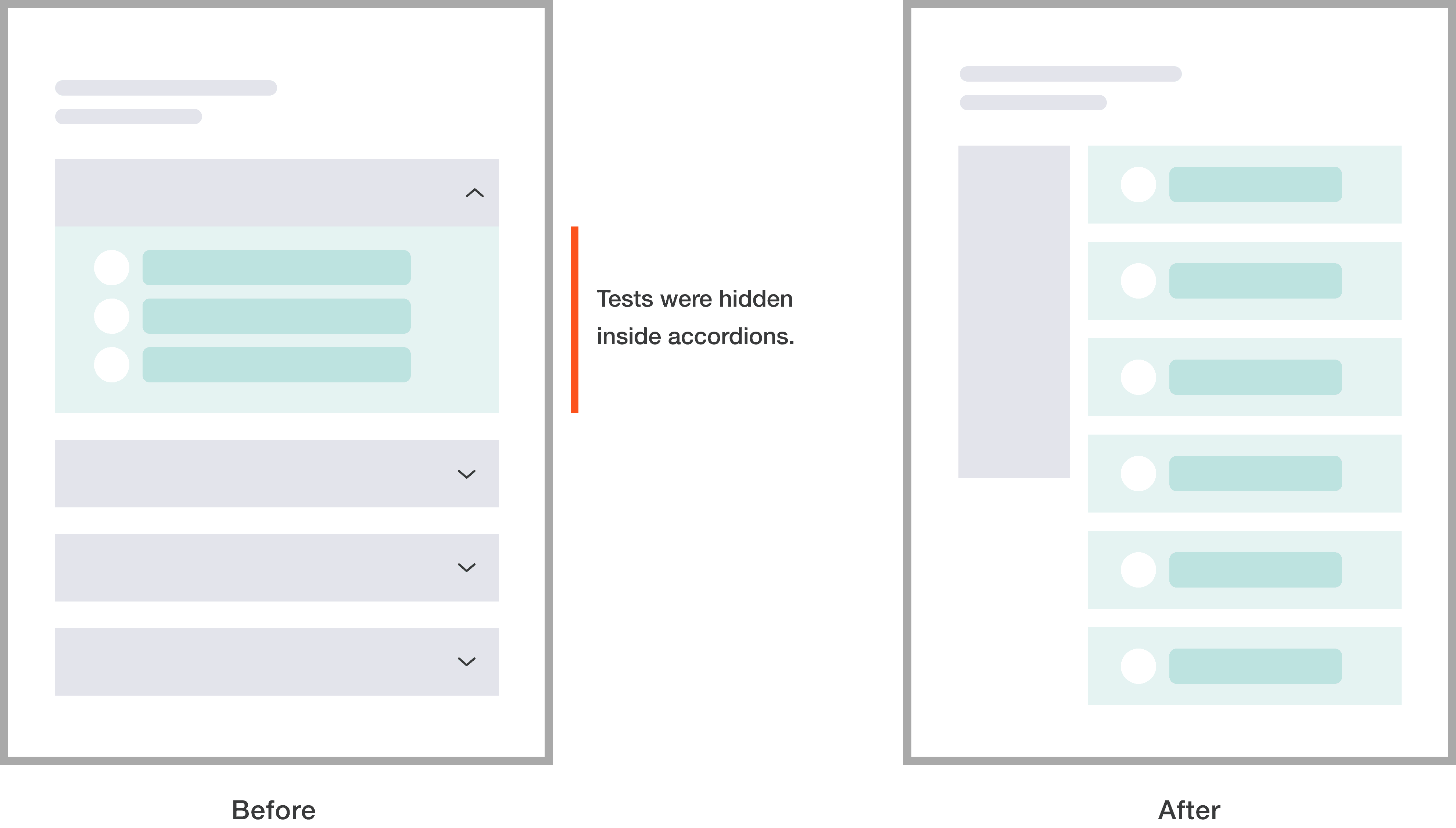
Make browsing frictionless
The test category page shows all the relevant panels available within that specific test category. We removed the accordion that served as subcategories. Users expressed that it was the most tiresome interaction since they had to click every accordion to see all the test offerings.

Allow providers to customize gene selections
The goal of the test details page is to provide a clear content and information hierarchy, allowing users to easily digest detailed information. Additionally, users can customize the test on this page. This means users can exclude certain genes from the test to tailor it more precisely to their patients' needs. This can be achieved by clicking on each individual gene tile to remove them.
Streamline the workflow for quick access
We streamlined the workflow by providing multiple pathways throughout so users can go straight into different levels of the product.

Final Design
Test catalog home

Test category page
Add-on genes
Some ofthe tests come with add-ons at no additional charge. These add-ons appear as the test card expands. The design intent is to increase users' awareness of what's included in the test.
Gene lists
Many providers asked for the feature where they can see the list of genes included in the test, and able to copy and paste on their note.
Test detail page
Content
Test detail is broken into bite-sized chunks to enhance comprehension. We showed only the key summary upfront and hid additional information to help users focus only on what matters to them.

Customization
With new design, users can easily customize their test by removing certain genes. With progressive disclosure, the full list of genes appears incrementally to avoid overwhelming users with the sea of genes.

Design System for CMS
To maintain consistency with the new ordering flow, we have also redesigned the other pages of the Inviate website. These pages will be developed using a Content Management System (CMS). During the design process, I focused on creating components that could be reused throughout the website.


Impact
After Phase 1 launch, the add-to-cart rate increased by 72%
New design was released incrementally focused on the key metrics: Add-to-Cart rate and Order completion rate. Now we have a baseline to continue to improve both, which supports the user and grows the business.
