NIPS Testing Results
Designing early pregnancy test experience

Opportunity
NIPS (Non-invasive prenatal screening) screens for the risk of chromosomal problems in the baby in early pregnancy, and it is the earliest way to reveal the sex of the baby. And it is the top-most ordering volume at Invitae.
There was an opportunity for Invitae to increase its presence in the competitive OB-Gyn market, and becoming the go-to-place for women on their pregnancy journey. To do that, the company has to offer high-quality NIPS products and an equally excellent results experience.

Goals
Increase engagement of patient portal
Increase engagement of patient portal
Increase engagement of patient portal
Understanding emotional journeys for 2 different test results
“If the results are negative, I’m in the clear, and I just want to know if the baby is a boy or girl.”
— Janet, 2 month into pregnancy
“If the results are positive, I need to understand why, and what next steps can be taken. As I’m not an expert in the field, I need to know who I can talk to.”
— Carole, 3 weeks into pregnancy
Early sketches to validate the concept
While the Marketing team was creating the video, we started to sketch how the key features would be laid out. Then we turned some of the sketches into wireframes and tested them with users.

Users weren’t excited about the concept
We found out that the users weren’t very excited about the idea of watching a video. It was hard to know what that experience would be like without watching it in real life. Some even mentioned that the idea of watching a video sounds cheesy.
Going back to the drawing board
Instead of placing a 'Watch video' CTA front and center on a page, we first needed to engage users with conversational copy and naturally lead them into the flow of watching a video.
The video (content) wasn’t the main focus of this experience, it was about how we engage and interact with users through friendly, intriguing interface.
Finding out a baby’s sex is an exciting and joyful experience
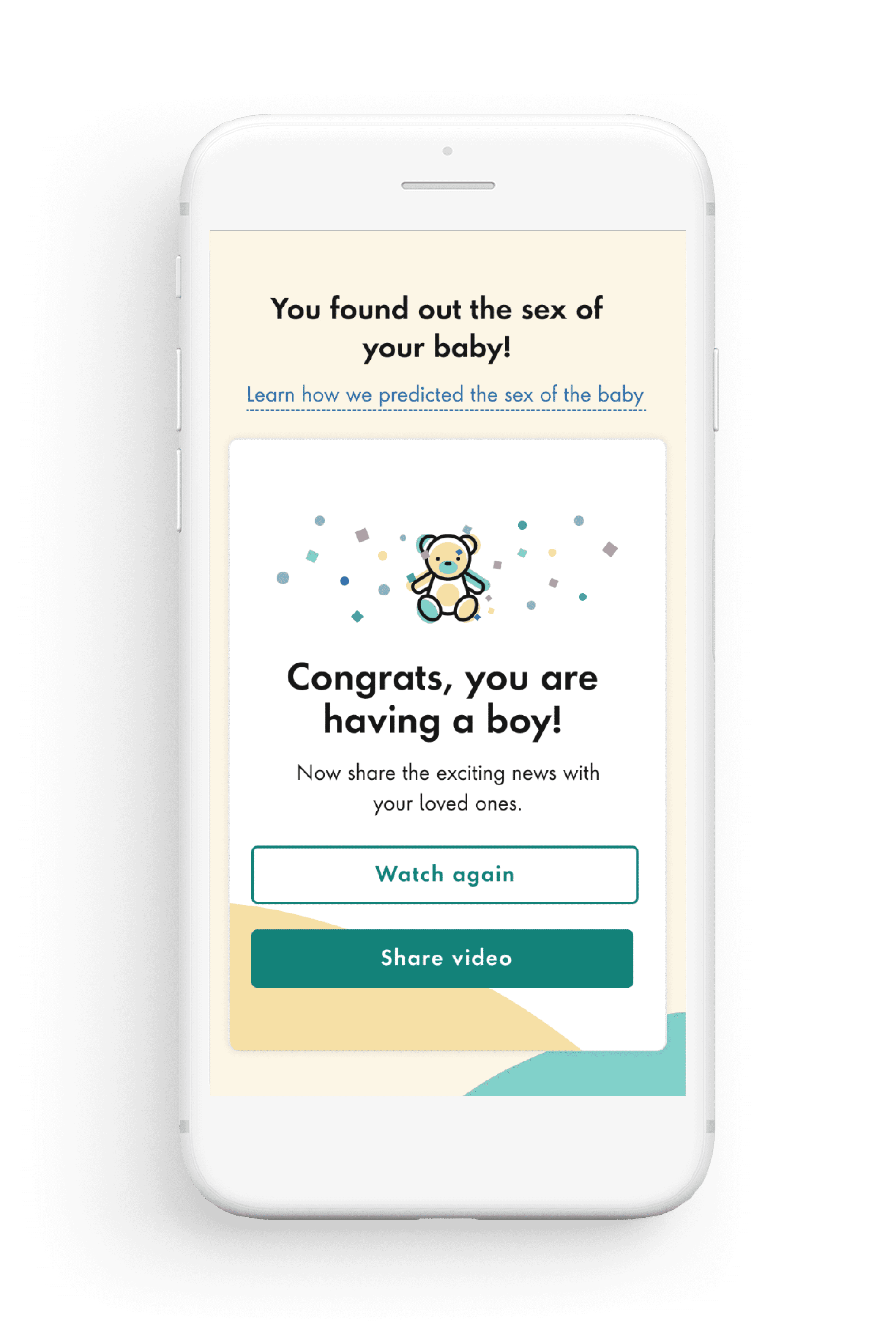
The highlight of the NIPS result for patients is finding out the sex of the baby, and we wanted to reveal the news through a short video instead of text. Our hypothesis was that if the video connects with the viewer and elicits emotions, it is more likely to be shared with others.
Final design
97% of tests return negative results, and the new design reassures patients no abnormalities were found, allowing them to focus on discovering their baby's sex.


Positive results
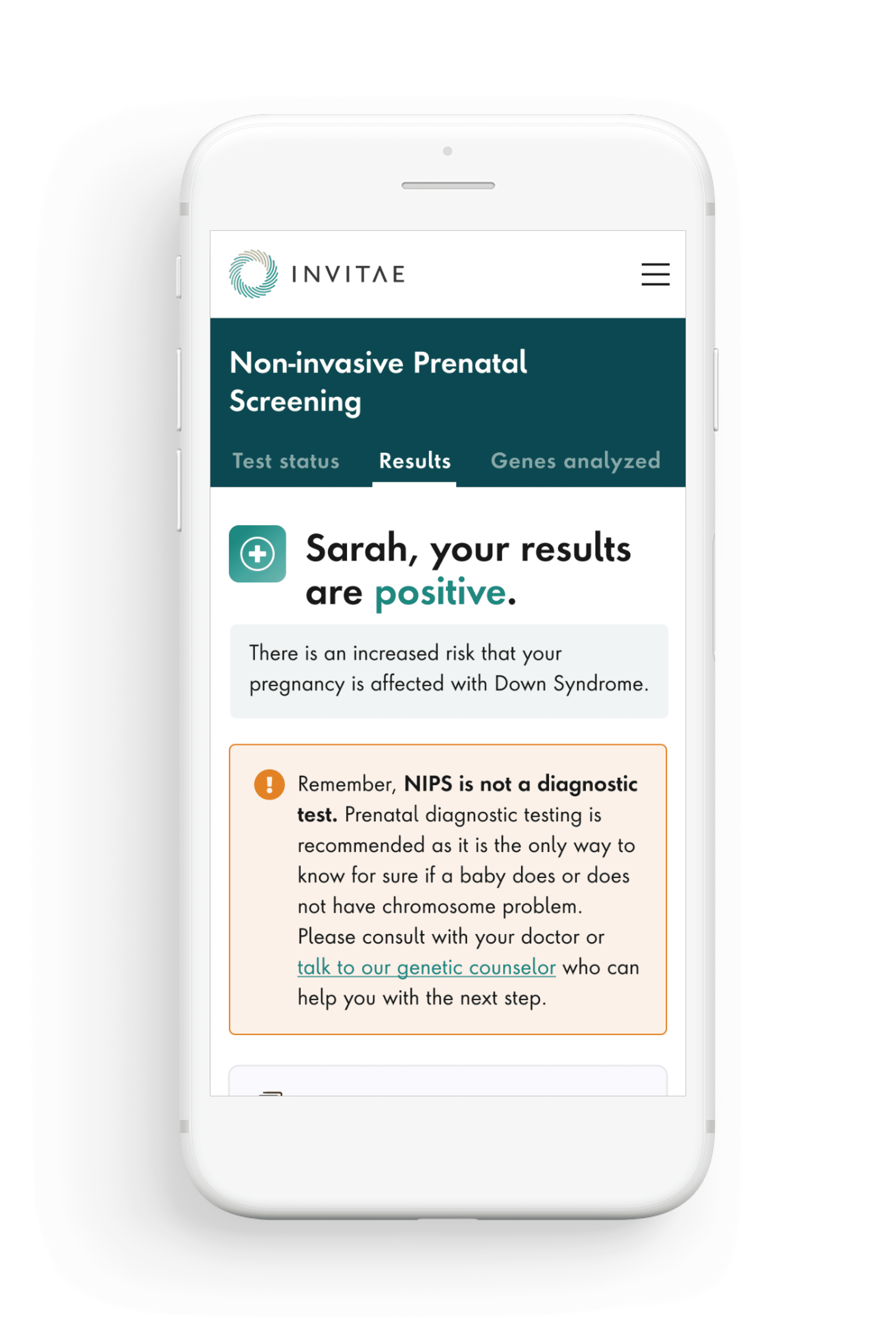
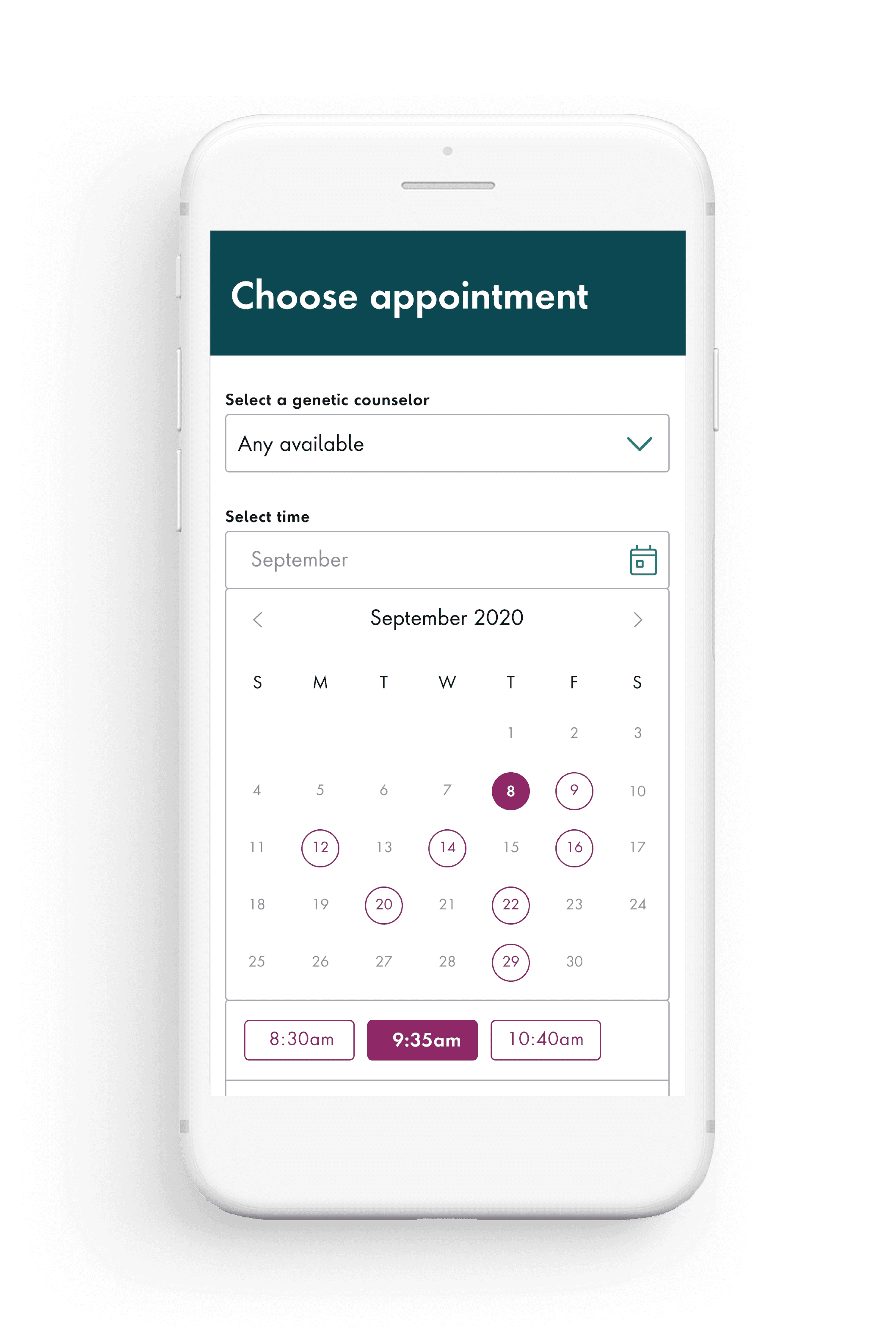
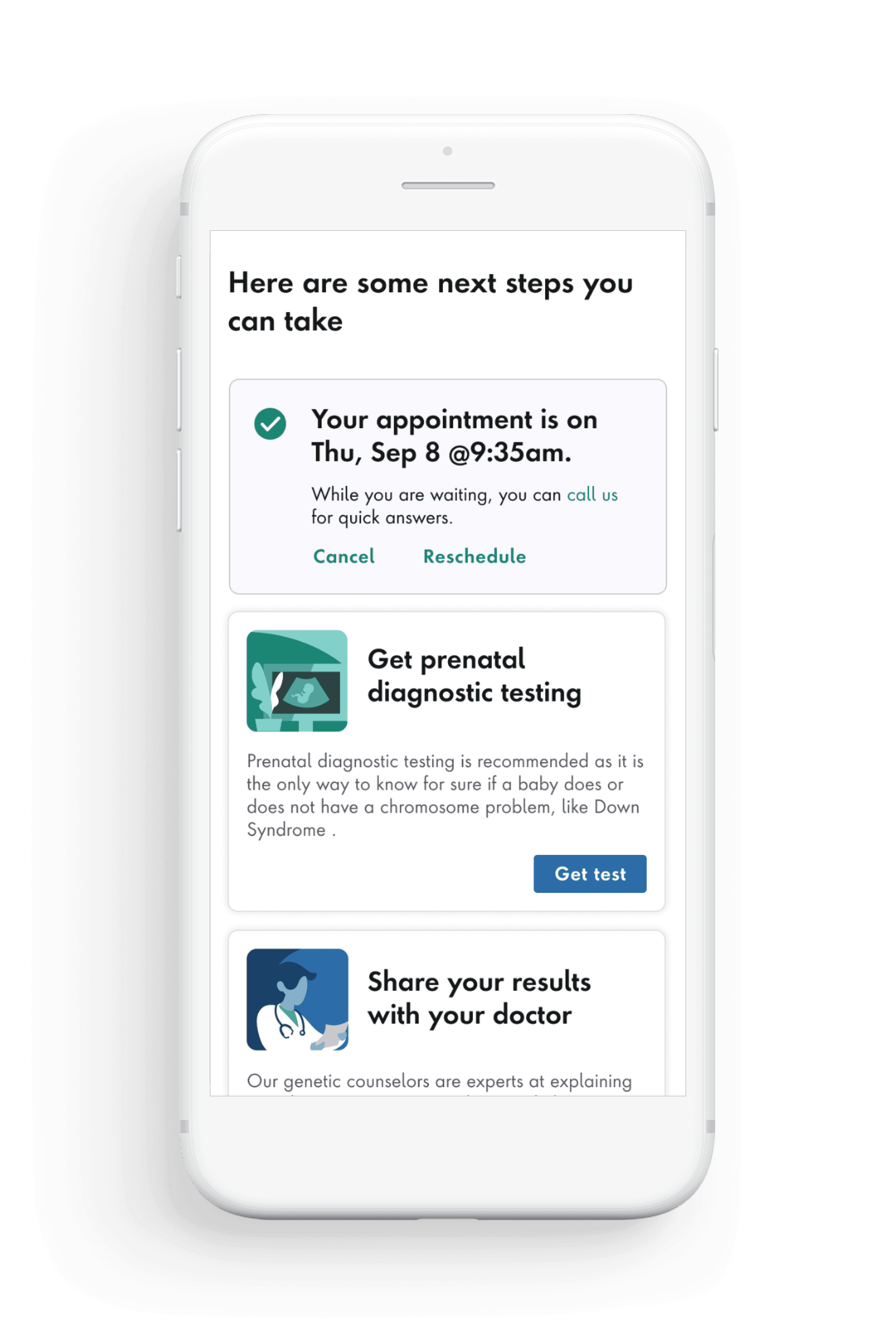
On average, only 3% of NIPS tests come back positive. However, it's these individuals who need the most empathy and support. Instead of focusing on the sex reveal feature, the design prioritizes immediate actions that patients can take to make their experience as clear and manageable as possible.


Responsive web
To make a responsive portal experience, I created mocks and design specification for desktop, tablet, and mobile size screens.


Impact
We saw a +60% increase in patient portal engagement, with 23% of patients sharing the baby’s sex reveal video with friends and family.
“Made my day with the news of it being a boy!Plus, I like the fact that I can look at a full report and still be able to understand the results!”
— Anonymous patient


